They say, “Don’t judge a book by its cover,” but let’s be honest—we all do. That’s why covers are still so important, even though we’re reading more on devices than ever before. We still want that image, that tease, or whatever it is that cover provides to lure us in. 😎
Hot 🔥 vs. cute? Real vs. graphic? People vs. objects? There’s a real debate here because, let’s face it, the cover is our first impression. It’s what gets us to read the blurb or, at the very least, the title. (But titles? That’s a whole other post.)
As for me, I prefer hot, real people on the covers of my smut. My Goodreads feed looks like the pages of an inappropriate magazine. 😏 Or, sometimes—though not often—graphic objects that somehow feel relevant, even if I don’t fully get the connection until I read the book. 🤔
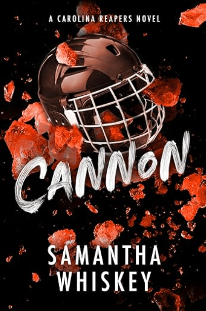
Take my beloved Samantha Whiskey, for example (who is an auto-read/buy for me, and should be for you too). She recently updated the covers for her Caroline Reapers series. Now, thank the goddess, SW gave us a heads-up so we could grab copies of the original covers before they were replaced. Authors, take note: warn us when things like this are happening! We love a re-release or update, but sometimes, there’s no replacing the OG.
Cannon is one of my favorite books—I re-read it all the time. It’s an old, comforting, hot-af BFF. And that original cover? It’s the stuff of fantasies! (For real, the whole cover series was absolute 🔥. Axel? 🥵)

Which covers are for you? And if you aren’t sure then scroll through your Goodreads or KU titles, it’ll be real obvious, real quick. 😉
TTFN, M

Leave a comment